
Graphic Design in the Internet Age
Understanding Light On My Computer Screen
Your computer screen is composed of many little lights! These lights are tiny little pixels that are created by process between phosphors and electron guns with phosphors that produce green, red and blue light or a combination of those primary colors. Your screen also has LED lights that literally backlight your display so that your screen can be brighter or dimmer, as is your preference. If you’ve ever accidentally mistaken the dimmer button for the power one, you’ll know what I mean. If the light is on bright, your screen colors will appear more vibrant and vice versa.
This is what makes it so difficult for me as a designer and a customer to confirm that we’re looking at the same color or not. Let’s say a customer sends me an image of a red custom t-shirt she wants to order. My screen is turned up to bright. Her screen is on a dimmer setting. She might say “I love this dark red t-shirt color! What do you think?” And I might say “Um, I love it but I’m showing a bright red t-shirt over here, did you want to do a different color?”. It might not be such a big deal in that situation but in the case of say a team supporting a product or a business, if colors are off it can really put a damper on what you thought you were ordering.
As discussed above, phones, software, the age of the technology (yes the age of your screen will affect color), the manufacturer of your device/computer will all affect how you see a color. Once the product arrives, the color might slightly vary (the goal) or their might be a drastic difference (we try to avoid this)
How can I set myself up to succeed when I order custom products so the colors are what I expected them to be?
- Know the settings on your screen. Always turn off dimmer or pause apps like blue light or night time apps. This will allow you to look at the design as “bright” as possible. Whether you work with me as a designer or you work with another graphic designer online – most, if not all, of us max out the brightness of our screens.
- Look at your design on more than one screen. Since every screen can be different – trying and look at your design on two different screens. If there is a big variation then check with your graphic designer on what screen they are looking at.
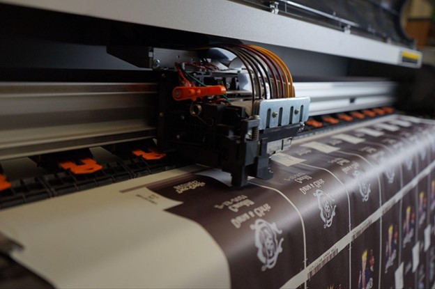
- Know the print technique that will be used to print your product. There are a lot of different printing techniques in the customization industry. Screen, DTG, heat sublimation, vinyl, etc to name a few. If you ask your designer what technique is going to be used to print your product and how that will affect the color, then it will let them know you know what you are talking about and they will explain it to you.
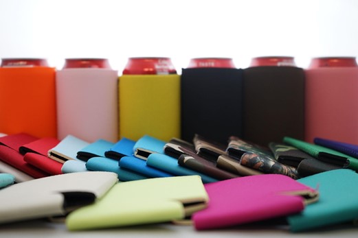
- Use precise color names or numbers. Colors actually have codes – Pantone and CMYK are the two most commonly used. You can use the numbers associated with them to tell the designer what color “island blue” or “emerald green” you are expecting. Avoid saying things like I want a light bluish green color. Try to find the exact color online by googling it and using the number or proper name for the color you want to print.
- Finally – ask for a sample! For starters if a print shop does not offer printed samples, you probably don’t want to work with them as they are not proud of their product quality! Most print companies do offer samples for a fee. Our fee at https://www.coolienation.com/ .com is between $25.00 and $50.00 dollars. However we do give you a full credit for the sample purchased if you end up purchasing the product, so in a way it is free. A printed sample will allow you to see in person the colors and thus eliminate the confusion!
I hope this little blog helped you understand the importance of colors and how to minimize and eliminate color mistakes when designing custom products online! If you need design help or color help – just email me at [email protected]! I would be happy to help!